

Dyffryn
Fernant
 Scroll
- Branding
- Signage
- Web
- Stationery


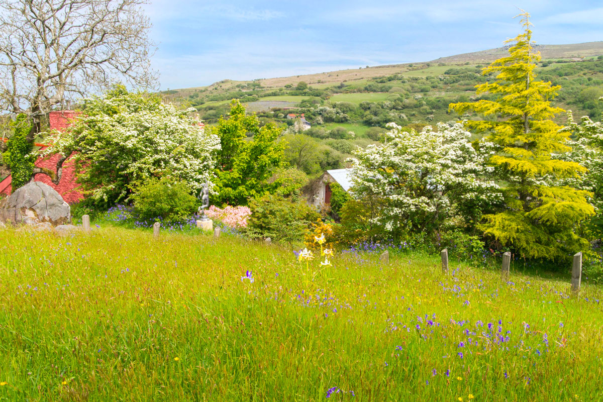
Living, Growth
& Nature
The
Solution
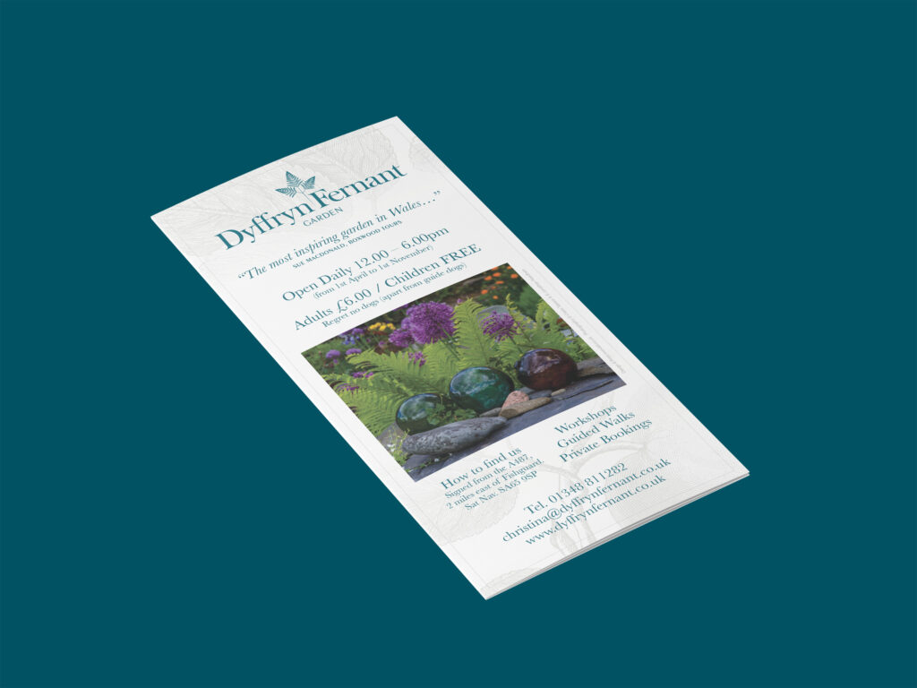
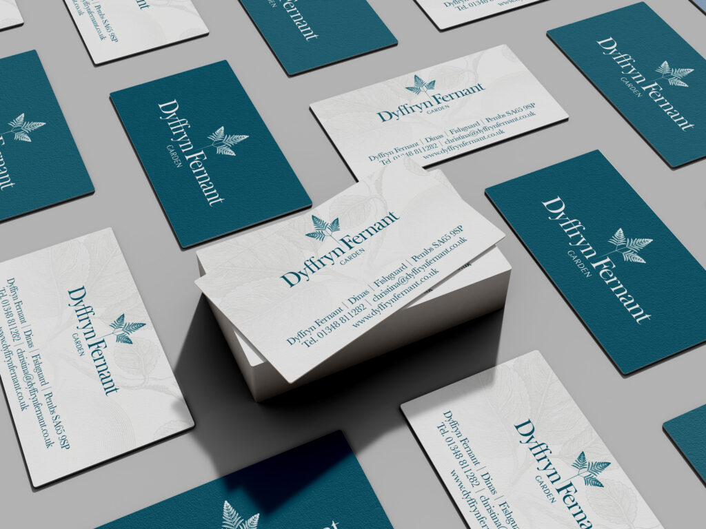
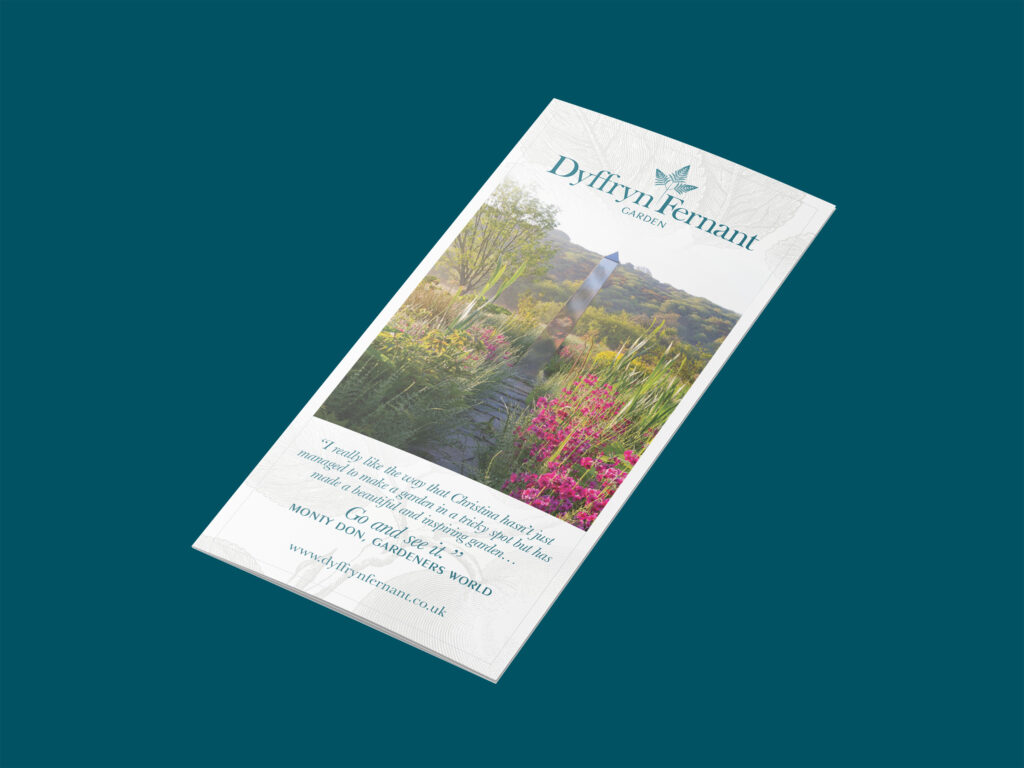
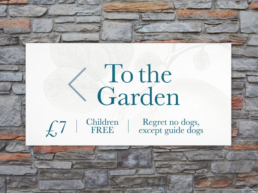
The chosen font has a history in the book typesetting tradition. The mixed weight of its form pairs well with the unique mark and has a further connection to the living, growing nature of the garden.
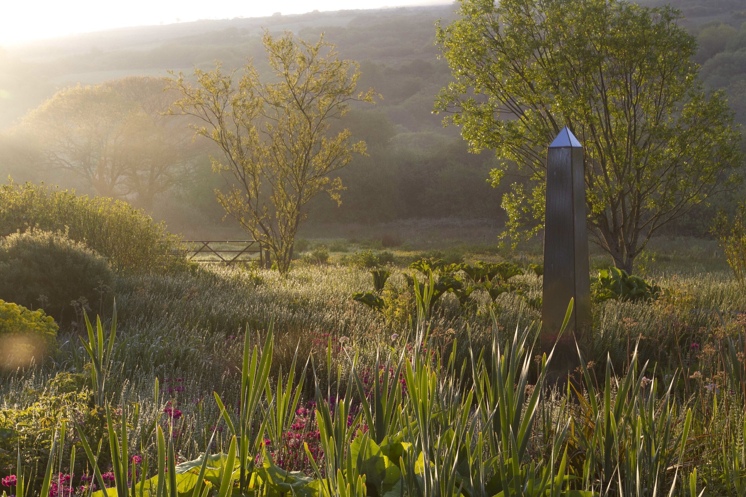
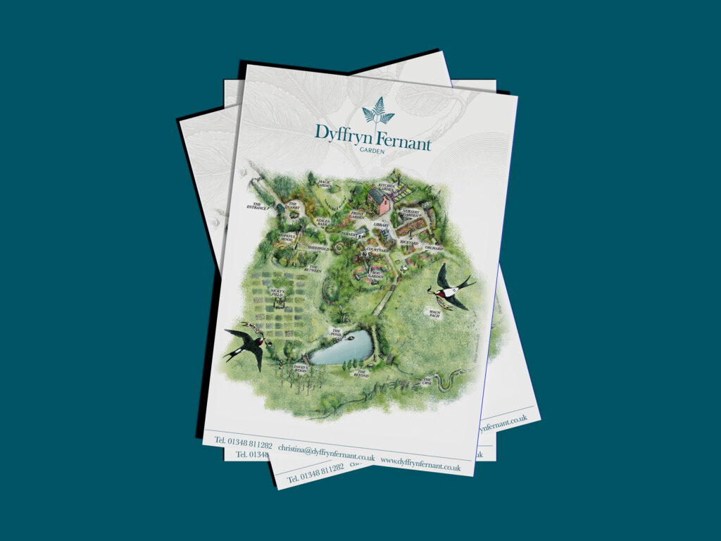
The logo, which depicts a native oak fern, was chosen to mimic the monolith. The triangular structure, which points in multiple directions, gives the brand design a sense of looking outwards and onwards. The use of natural elements in this brand design gives the finished product a softened formality, with a light-hearted and aspirational yet refined and textural feel.
To see more of our branding based on natural elements, see our work for Gwaun Valley Brewery.
Scroll
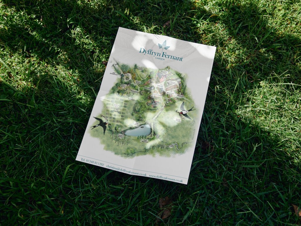



“Monddi have provided me with a first class website and branding which have launched our online presence with huge success. It is an unending pleasure to work with such elegant designers.”
Christina Shand, Overseer