

Eisa
Tea Co.
 Scroll

- Branding
- Packaging
- Stationery
contemporary and versatile
The
Solution
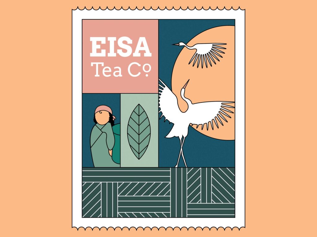
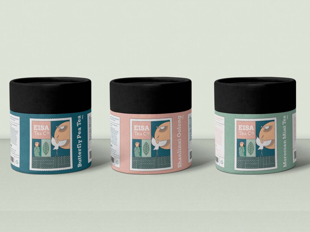
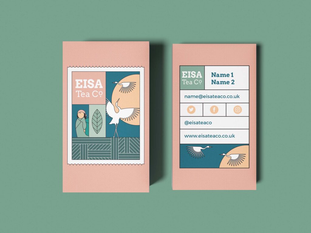
Firstly, Monddi used a unique font and bespoke illustrations in the packaging design to underpin the brand’s story. We created a custom stamp design to represent the historic importation of tea from Asia and the journeys of the co-founders. The two cranes in the design represent the co-founders themselves.
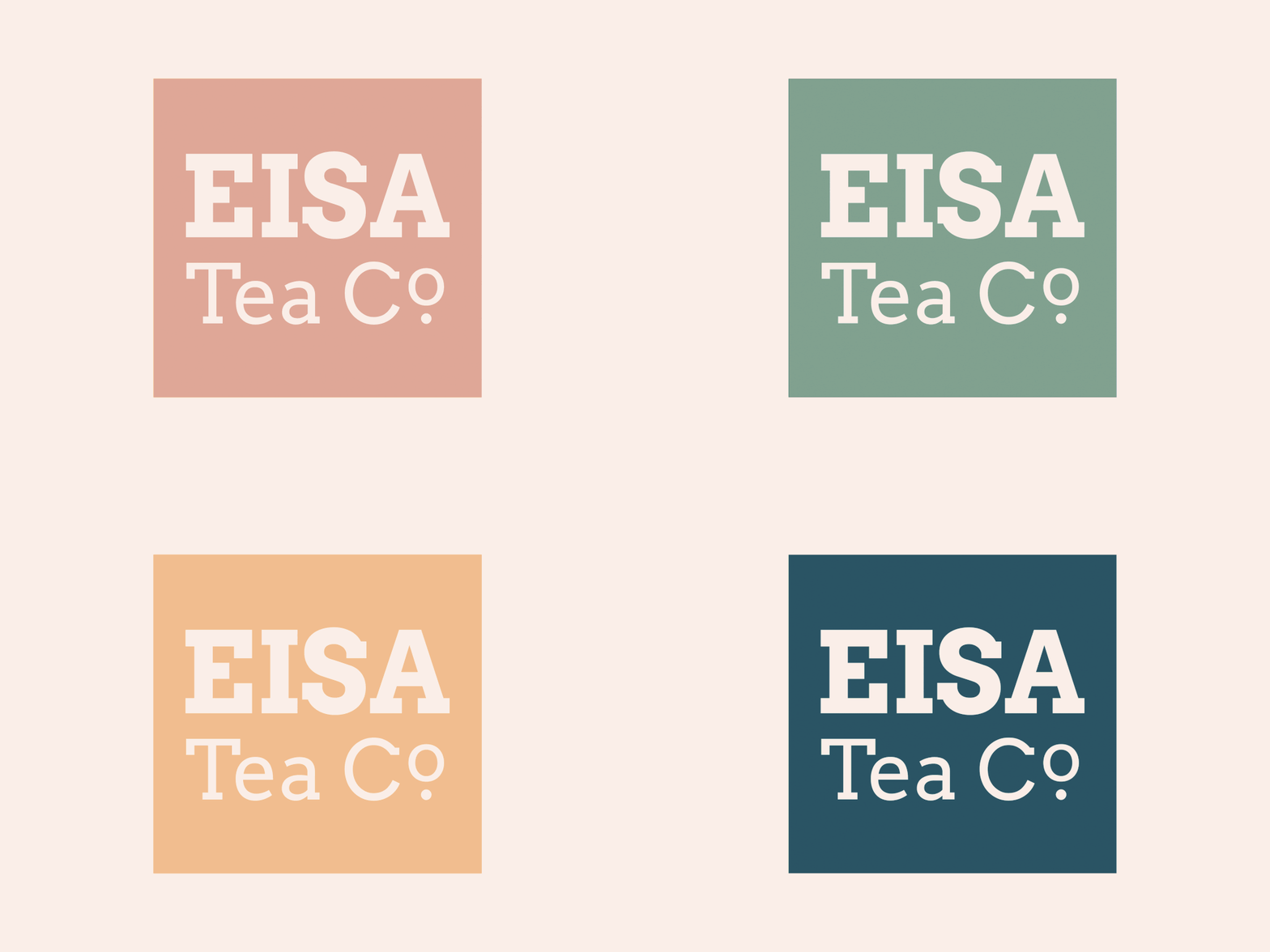
Then we chose a natural and earthy colour palette; its symbolism capturing the variety of cultures involved in this unique project.
Lastly, the logo’s contemporary and versatile typography lent itself to being used as a logo in its own right. It looks great on social media and other smaller mediums.
At Monddi, we love a challenge — and packaging design is one of our favourites to take on. To see some more of our most-loved projects, click here.
Scroll


“We had a wonderful experience with the team at Monddi, who managed to create our dream branding after just one call. They were easy to work with and quick with responding to our questions, and helped our brand come to life.”
Amy Aed, Director