

Ollie’s top 10 album covers of all time, ranked
As designers, we can’t help but look at everything we see with a critical eye, including album covers. With countless options out there, below are my ten favourites and the reasons I chose them. It was difficult to look beyond the music and just at the covers, so I’ve tried to be as unbiased as possible, but there’ll always be a couple that just hit the spot for content and aesthetics.
#10 – The Miseducation of Lauryn Hill
The cover features a carved wooden image of Lauryn Hill’s face on an old school desk. The design choice directly ties to the album’s themes of personal growth and education. The design is clean and focused with minimal typography ensuring the artwork takes center stage. The warm and brown tones of the wood convey a sense of comfort, grounding the viewer in the album’s soulful mood.
#9 – My Beautiful Dark Twisted Fantasy
This album features multiple covers, the most iconic being a painting of an abstract figure in an intimate and chaotic moment that aligns with the album’s themes of vulnerability and dark introspection. The painting elevates the album’s presentation to a level of artistic sophistication, blurring the line between music and fine art. The use of bright reds, blues and yellows convey energy, passion and drama which mirrors the music’s maximalist production.
#8 – Original Pirate Material
The Original Pirate Material cover is a masterful example of how an album’s visual presentation can amplify its themes. By choosing a stark, relatable, and atmospheric image, the cover reinforces the album’s narrative of urban life and gritty realism, making it both iconic and deeply resonant with audiences.
#7 – London Calling
London Calling is often regarded as one of the greatest album covers of all time and here’s why. The iconic imagery features a blurred photograph of Paul Simonon smashing his bass on stage. The image captures the raw energy of rebellion and frustration which are central to the punk genre. The blur and grainy quality of the image conveys authenticity and spontaneity which emphasises the DIY punk mentality. The pink and green type pays homage to Elvis Presley’s debut album where the type was similarly styled.
#6 – Madvillainy
The design of Madvillainy features a dark, grayscale image of MF Doom tightly cropped around his face. The simplicity of this composition allows the mask to dominate the cover creating a strong focal point. The sharp contrast in the image mirrors the raw tone of the album and its underground aesthetic. The monochromatic composition is balanced with a pop of colour from the small orange square in the top right corner without overpowering the image. The minimalist design of this cover is able to communicate so much identity and mystery with so little.
#5 – Return to the 36 Chambers: The Dirty Version
The design mirrors a government-issued food stamp ID which grounds the album in a gritty realistic setting and reflecting ODB’s raw persona whilst also challenging the idea of glamour and wealth in hip-hop. The food stamp ID is a powerful statement making the design a commentary of poverty and struggle. The typography on the cover deliberately mimics the typefaces used on government documents which enhances the sense of realism and authenticity.
#4 – Sgt. Pepper’s Lonely Hearts Club Band
This cover introduced the idea of an album being an immersive art experience rather than a compilation of songs. The collection of characters alongside The Beatles creates a complete narrative and identity for the album. The cover features over 70 cutouts of historical and cultural icons which invites the viewer to explore the deeper details within the artwork. The bold use of the red, green, pink and blue costumes immediately catches the viewer’s eye whilst also aligning with this album’s playful and experimental spirit.
#3 – The Low End Theory
This album uses a stark black background which causes the figure painted with neon paint to pop dramatically. The simplicity of this cover ensures that the focus is held on to the figure and the typography. The use of curved lines on the central figure evokes feelings of rhythm and groove which parallels the album’s jazz influence.
#2 – Never Mind the Bollocks, Here’s the Sex Pistols
The cover features high contrast, a fluorescent yellow background with pink and black text which grabs hold of the viewers attention making it unignorable. The cut and paste style of typography evokes the theme of rebellion and anarchy. Simplicity combined with a striking colour palette ensures instant recognition from viewers, making it one of the most notable designs in the music industry.
#1 – 3 Feet High and Rising
My all time favourite album cover from one of my favourite artists for good reason. The cover features a bright, eye-catching colour palette of yellow, pink and green which immediately grab attention and convey the album’s upbeat and eclectic sound of De La Soul. The psychedelic and playful design aligns perfectly with the group’s themes of peace, individuality and positivity, breaking away from traditional hip-hop convention of gritty, hyper-masculinity. This album is a masterclass in aligning visual art with musical identity that broke boundaries in hip-hop design.
How does my list line up with yours? We’d love to hear your favourites!
Check out our other posts
 Our 2025 big beach clean
The Jump Group’s annual beach cleans are a cherished tradition here at Monddi! They’re a wonderful opportunity for the whole Group to come together in person and share our commitment to giving back to the planet.
 Giving back through local environmental partnerships
This year, Earth Month is focused on community efforts; coming together to give back to a cause. That’s exactly how we operate already at Monddi, working as a team to do good. We’ve recently embraced partnerships with two local charities working to improve our environment through education, awareness, and physical action. One of our partners […]
 The Monddi book design process
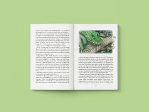
One of our favourite kinds of projects to take on is book design and print; these are incredibly personal projects that we love to see to the end. We have a lot of experience ranging from children’s illustrated stories and picture books to local history books, autobiographies, poetry books, and novels. If you’re working on […]
 B Corp Month 2026
B Corp Month is officially here! This March, we’re taking time to reflect on what being Certified B Corp under the Jump Group means to us. As a Pembrokeshire-based business for over 100 years, our local environment has always been incredibly important to us. Surrounded by woodland and water, our team feels strongly about preserving […]
 6 design inspo sites every designer should bookmark
Sometimes your brain needs a little push to deliver the unreal creative outcomes you’re used to producing, and finding that inspiration can feel impossible. With so many websites, books, magazines, and social media apps out there, where do you go to find guaranteed hits?
 Our top 10 Pantone colours of the year, ranked
Every December, The Pantone Colour Institute divides the internet with the announcement of its Colour of the Year. Since the year 2000, the company has come together to analyse all sorts of global trends and influences; from film and tv to fashion and everything in between. It often represents the general mood and hopes of […]
 Our beach clean for Volunteers’ Week 2026
Volunteers’ Week takes place from June 1st to 7th, celebrating the work that people do in their communities. Today we got together with multiple other businesses, joining the Pembrokeshire Coast National Park Trust’s Big Beach Clean. Meeting at the gorgeous Freshwater West, we set off with the aim of leaving the beach in a better […]
 Our first beach clean of 2026
At Monddi, we put our ethos at the forefront of everything that we do. From working with local suppliers where possible and ensuring environmentally friendly processes across digital, design, and print; we put our money where our mouth is. One of our objectives as a company is for each of our employees to dedicate a […]
 The best rebrands of 2024, ranked
For long-standing brands, there comes a time when their identity just doesn’t quite fit anymore. We’ve picked out our favourite rebrands from 2024, and ranked them from least to most favourite.
 Different types of menus, explained
Selecting the right kind of menu design and print solution is key in curating a dining experience that aligns with your business. Below we’ve outlined some of the main kinds of menus, so you can figure out which option is best for you. Menu covers Menu covers come in a variety of shapes, sizes and […]
 We gave our website a new look, and you should too
Over the last few months, we’ve been chipping away at an updated website design. Keeping elements from our previous site, we’ve refined our brand consistency, updated imagery, and brought in more interactive elements to create an engaging and contemporary experience.
 How to make a killer mood board
What can sometimes feel like a boring step in your creative process is actually key in keeping you on track. Mood boards help to set the tone of a project from the get go – whether it’s a brand identity, clothing collection, wedding plan, or kitchen design. We start every branding project with a mood […]
 How branded accessories can make you stand out
In a world full of social media and short attention spans, capturing an audience is harder than ever. Having unique, bespoke accessories for your brand opens up a world of opportunities, becoming more shareable and increasing growth through word-of-mouth interactions.
 Minimalism: sometimes less is more
In the world of graphic design, trends come and go. But one approach has stood the test of time: minimalism. This process is rooted in simplicity and clarity is a staple of modern design and serves as a reminder that sometimes, less is more.
 The magic of foiling for seasonal print
Foiling adds a luxurious and festive feeling to seasonal print materials – think Christmas cards, gift vouchers, or limited edition packaging. Special finishes like foil can make your marketing, product or gift that bit more memorable. Let’s start from the beginning; what is foiling? Foiling is a finishing technique for printed materials where metallic or […]
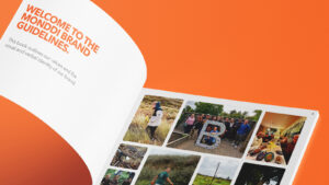 The importance of brand guidelines (and what to include)
When creating a brand identity, we often are asked to supply brand guidelines too. These documents provide guidance on how a brand should appear – essentially a ‘dos and don’ts’ of brand usage.
 8 summer colour palettes for your brand
The summer weather has us looking forward to bringing the sunshine into more of our projects, so we’ve put eight colour palettes together to get that inspiration flowing. These all have a certain vibe that makes them ideal for particular uses, from dreamy pastels that would look stunning across wedding stationery, to punchy brights that […]
 Our favourite marketing moments of 2025
2025 saw a number of bold campaigns, from out-of-home ads plastered across London billboards to TV ads, and we couldn’t get enough of some of them! Here are just a few of our favourite advertising moments throughout the year, although there are so many more we’d love to include.
Colour theory: evoking emotion through design
Colour is one of the most important tools a graphic designer has. It has the ability to evoke emotions, influence decisions and communicate meaning without using a word. Colour theory is an essential aspect that can help your audience connect on a deeper level.
 Planet-friendly design tips for earth month and beyond
To celebrate Earth Month, we’re passing on some tips for you to make more sustainable choices when it comes to design and print. Read on to discover some surprising methods to reduce your negative impact on the planet.
 Belmont Estate: an exciting new partnership
At Monddi we believe that real change begins with real connections. We’re proud to begin a new partnership as a part of the Jump Group, with the remarkable Belmont Estate, a place where regeneration is not just an idea, but a daily practice.